adobe.com
B2B: Creative Cloud for Teams
BACKGROUND
During my first few months at Adobe, I hopped onto projects helping with B2B split tests and campaigns. We aimed to get more conversions, visibility, consistency across targeted pages.
This meant mainly working on the Creative Cloud for teams (CCT) plan, which spanned across product, plan, pricing, and other sub-pages.

Creative Cloud for Teams
Plan Page
Project Scope
For months, our Creative Cloud for teams (CCT) plan page was left untouched as other parts of the B2B team focused elsewhere. And that meant new plan language, offerings, and even value props were outdated.
Armed with that knowledge, I was asked to re-imagine the CCT page for a test. Ultimately, we wanted to boost conversions, monitor engagement, and test new messaging.
The Strategy
After speaking with the product manager and UX designer, we decided we wanted to make this page accessible to all businesses. We planned to:
Put value props front and center — with a secondary focus on features.
Use plain, accessible language that can appeal to business prospects of all types.
Make plan features clear and highlight how CCT elevates the Creative Cloud plans for individuals.
New Page Designs
Marquee
In the header, we put the idea of limitless creation front and center. Then we go into feature messaging highlighting the value of a subscription with business-specific elements exclusive to Creative Cloud for teams. Whether a team needs creative apps like Photoshop or productivity apps like Acrobat, Creative Cloud for teams has it.
Value Props
This is where the benefit-focused messaging really shines. Before our revamp, the page’s messaging leaned heavily on features instead of “what’s in it for me/my business?” Working with the stakeholder and UX Designer, I proposed highlighting these four major solutions to problems businesses might be facing: lack of a brand voice, collaboration pain points, safety concerns, and poor customer support with competitors.
Plan Cards
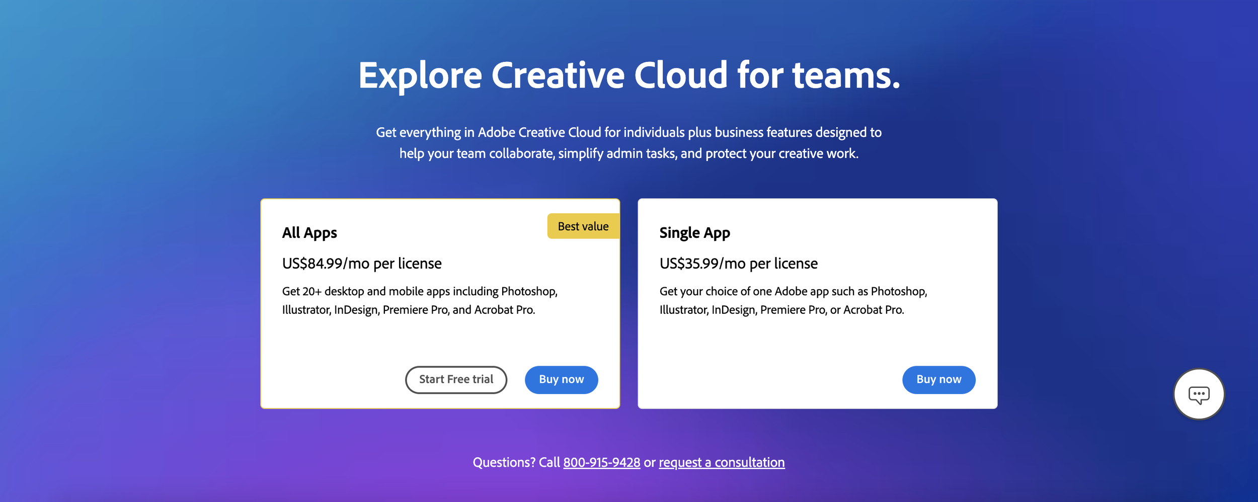
In the previous version of the page, we dryly presented our plans as if we were speaking to a computer. Behind every business is either one or a team of human beings. Approachable copy that’s still straightforward will perform a whole lot better than “Here is XYZ product. Buy it now!” So that’s what I did. By using verbs like “explore” and “help”, we’re speaking to the human being behind the business — no jargon or filler.
Features
After making their way down the page, the user will embark into the deepest level of our messaging: features. While we weaved features into the fabric of the page above, we’re really diving into the nitty gritty here. Ideally, if they’ve reached this level of the page, they’re on the precipice of awareness to consideration. This is where we take the original pain points and highlight ways the Creative Cloud for teams subscription solves them.
The Result
After running our test for several weeks targeting a segmented audience of users visiting the CCT plans page, we had the results of our new design:
Test winner vs. the control by a significant margin.
Conversions and engagement soared above our goals.
Default experience was immediately rolled out for all U.S. traffic.
The CCT team used copy from our designs in later iterations of the page.

Product Page Marquees
Project Scope
Members of the B2B team at Adobe asked me to think up new subheader copy targeting businesses for four product page marquees: Photoshop, Illustrator, InDesign, and Premiere Pro.
Our goal was to increase conversions/ARR for our business plan, Creative Cloud for teams.
The Problem
After speaking with the CCT campaign team, researching past versions of the marquee, and auditing the copy, I realized:
Each subheader wasn’t tailored to businesses/teams.
The language was inconsistent across each page.
We hadn’t incorporated past test-winning findings or added up-to-date features that echoed messaging on business pages.
The Strategy
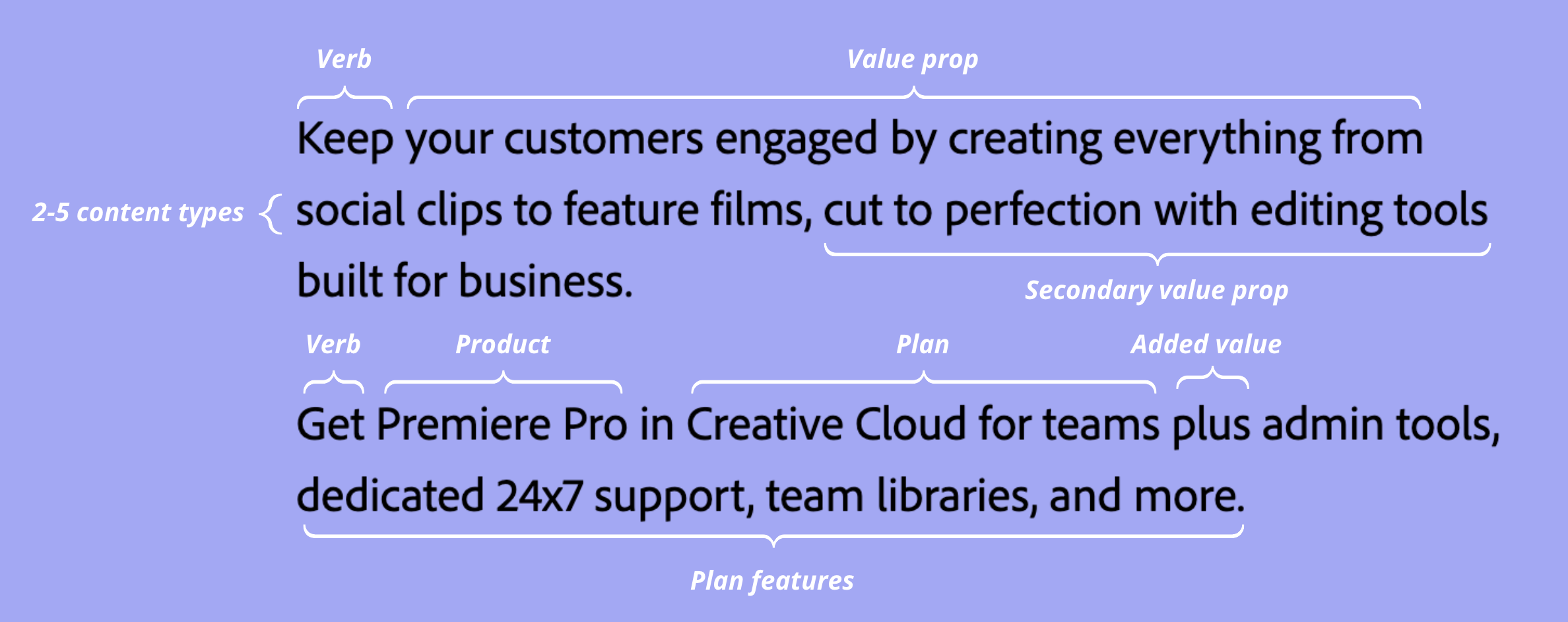
To create a common thread between the pages — and best speak to business prospects — I decided to make a subheader copy blueprint.
It was the most effective way to hit our messaging goals and create a common thread between each page. That way, if users hop between product pages, they’ll know they’re still looking at business-focused content.
Final Copy & Designs
Photoshop Marquee
Illustrator Marquee
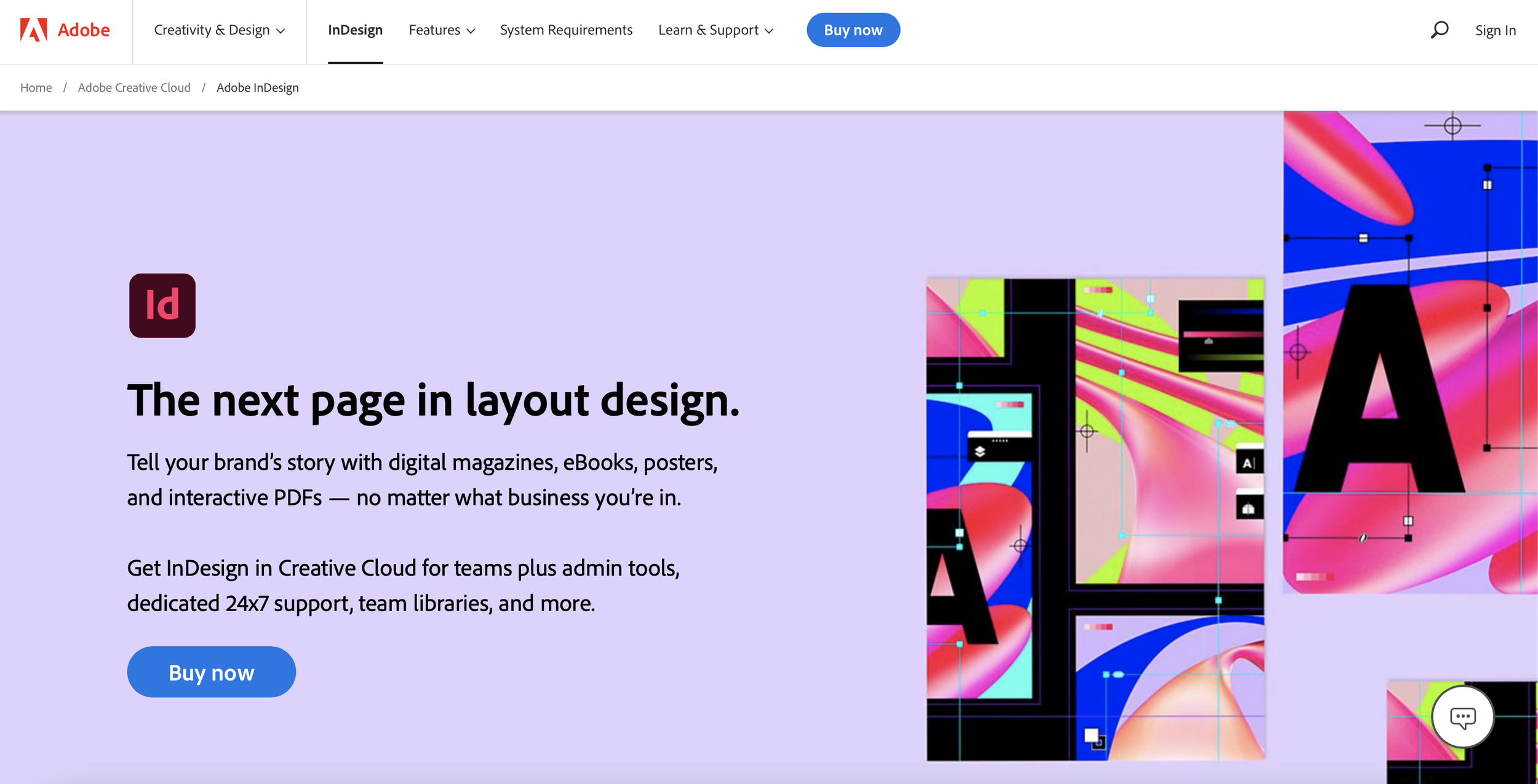
InDesign Marquee
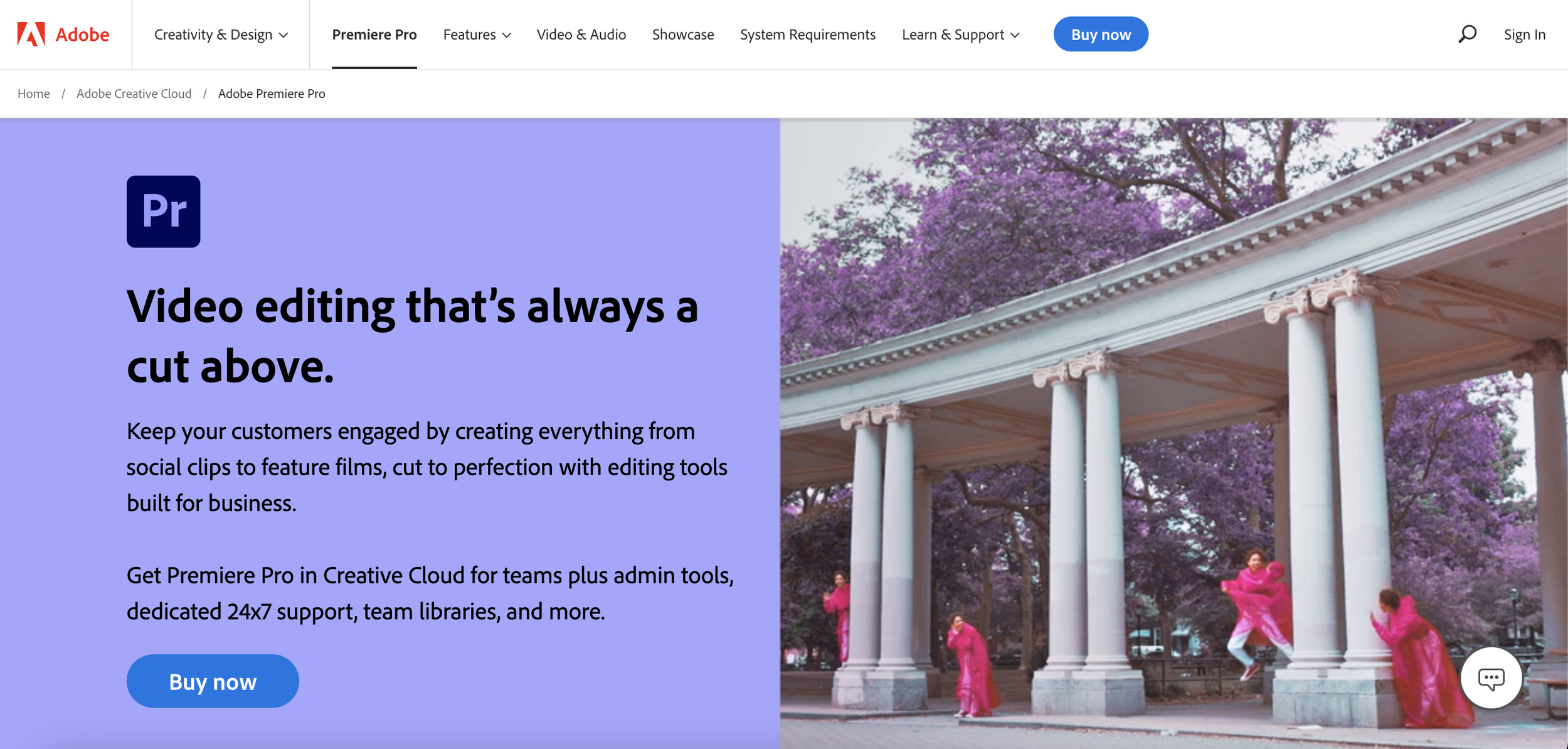
Premiere Pro Marquee
The Result
After weeks of A/B testing the original product page copy vs. the new copy, these were our findings:
Our analytics team determined the new copy was a test winner by a large margin.
We saw statistically significant results with higher conversions and ARR.
We rolled out our new copy across each live product page (shown whenever a user was signaled as a business prospect).


